Seriously.
So I had to get up to speed quickly on building a better deck. While I don't consider myself an expert, I do think my slides have gotten 1000% better, and I wanted to share what I've learned, so that hopefully you can improve your own decks. Here's my 6 keys to building a better Powerpoint deck:
1 - Think visually. We remember visuals better than words in most cases. To that end, please go buy Presentation Zen by Garr Reynolds. If you are serious about your speaking career, and have to create Powerpoint decks regularly, then this book is a MUST have. The book has wonderful before and after examples, especially of taking very basic and generic (read: boring) slides and turning them into something amazing.
2 - Fewer words are better. Think about it, if you have 10 words on each slide, the audience isn't going to be listening to what you are saying, they are going to be reading your slides. If that's the case, you could have given them a handout with the words and not even shown up. Distill your slides down to as few key words as possible, then explain the relevance of those words. If all the information the audience needs is on the slides, then why are you there?
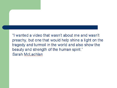
3 - Use quotes and key facts or stats to back up your points, and then use pictures with them. In the What Rockstars Can Teach You About Kicking Ass With Social Media presentation I gave at Social South recently, I wanted to add a quote from Sarah McLachlan. I could have gone with a cookie-cutter slide like this:
 But instead I went with this:
 See the difference? And here's another tip; notice that's a LONG quote. So I bolded the key words that I wanted to focus on, and didn't read the whole quote to the audience, just pointed out the two bolded phrases.
4 - Bullet points must DIE DIE DIE! Seriously, these are a crutch that need to be removed. The only time I can halfway deal with bullet points are at the very beginning of a deck to let the audience know the key points that will be covered, and then again at the end to recap what was learned. But if you have bullet points in the middle, it forces your audience to stop paying attention to you, and start reading your slides. Not good. If you MUST have bullet points, at least add animation that brings in the points one at a time.
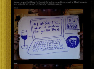
5 - Make your deck COMPLEMENT your presentation. Again, YOU are the main attraction here, the deck is simply a tool to help you educate, entertain and motivate your audience. Don't give it all away on the slides, for example, here's another slide from my Rockstar deck:
 If you aren't a fan of @AmandaPalmer and didn't attend my session, you probably have no idea what this slide is about, or why it's important. But if you did, this made perfect sense, as it tied into a case study I explained about how Amanda used Twitter to make $11,000.00 in two hours. But the slide alone really isn't that valuable without the explanation. This also helps people that are worried about putting their decks online for fear that someone will steal their ideas. The value of your presentation should be YOUR explanation and elaboration of the points you are trying to make with your slides. This is another reason why your slides should have fewer words, which requires YOU to better explain the points you are trying to make.
6 - Strive to be an expert. I know two things; my Powerpoint skills are 1000% better now than they were two years ago. And I also know that there is still plenty of room for improvement. That's why I closely study how others create great decks. Two people's work that I recommend you follow are David Armano, and Kelsey Ruger. Both create amazing slides, and I always learn something from them.
BTW if you are looking for sources of visuals for your slides, two things I use extensively are SnagIt! for simple screenshots, and Flickr photos that are available for use. Check HERE for ones that are and make SURE you add a link back to the Flickr user in your presentation, either on the slide itself, or at the end of your deck. Oh and if you are interested in viewing my Rockstar deck, here it is:
What Rockstars Can Teach You About Kicking Ass With Social Media
View more presentations from Mack Collier.
And finally, click here if you'd like more information on my speaking or want to get a quote on my delivering this presentation or another at your event, or email me.
PS: Thanks to Valeria and Everything and Nothing for being my editors for this post ;)

13 comments:
Wow great post! I am in the midst of making several presentations and this is just what I needed to put the finishing touches on them. Four years of university and a bet most kids won't get this much info for their presentations.
Thanks a lot and keep up the great posts.
Much appreciated!
Thanks for the great tips Mack. I am doing a presentation Wed morning and I can improve some slides I have now.
University professors could learn a lot from this one blog post!
hahaha!
The Sarah McLachlan example is great. Huge difference!
Great ideas and post!
Another great source for PPT presentations is the book, PresentationZen by Garr Reynolds.
Easy read, great ideas & examples, super endorsements!
As someone who has spent far too much time using PowerPoint ... SLIDE:OLOGY and PRESENTATION ZEN are great books about designing better PowerPoint slides.
Problem is... neither one gives step-by-step directions on how to create kick-ass looking slides.
BEYOND BULLET POINTS by Cliff Atkinson gives step-by-step directions on using PowerPoint to create slick-looking slides and cohesive prezos.
More here: http://bit.ly/FLhr8
Hi, I have found that webiste, they seem to combine developping personnal skills on presentation and the use of powerpoint, anyone has experience with that website ?
You left one out.
Pigott's Law of Powerpoint:
Animation for animation's sake is worthless.
If something is going to move on the screen, then it damned well better be moving FROM someplace significant TO someplace significant.
Turns out I have to do a presentation in the morning without slides completely. So that's being minimalist!
First time without any slides.
Great article! But I think you want your deck to complement your presentation, not compliment it! (Sorry... I can never shut up the editor in me!)
Update: I spoke to 30+ people this morning without slides at all. Just a page of one-line notes I had and it was great!
The slides are a crutch. Try it without them. All eyes were on me the whole time. I connected with each person in the audience better.
I may dump slides forever.
I posted mine! I'm so excited about this. Thanks for hosting it! http://www.directory.itsolusenz.com
@JimKukral Power point slides can be a crutch, but visuals can help connect for those who are visual learners.
One thing that I wish I could use more often when speaking is a whiteboard.
I used whiteboards fairly effectively when I was teaching SAT Prep. They were a great tool for getting kids who didn't really want to be there engaged.
How? With step by steps and DRAWING.
Of course, I'm a terrible drawer, but my kids claimed that made my visuals more memorable - they'd draw prettier illustrations and show them off to me and each other!
Love the Rockstar slides and the book, good tips, thanks. I got my Sherpa Summit slides to 1 bullet slide out 13, unfortunately I am tied to their template so I couldnt be more creative. Alas!
@ajdun
Post a Comment